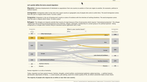
I was reflecting on the latest events in the world, and how we have been witnessing a lot of demonstrations and insurrections on an international level regarding ecology, social justice, freedom, human rights and so on. I thought it would be interesting to visualize the current state of the world based on some indicators. Then a few days later, I found myself in the middle of a conversation on democracy with my boyfriend, and all the ideas and points of views we exchanged prompted me to start there.
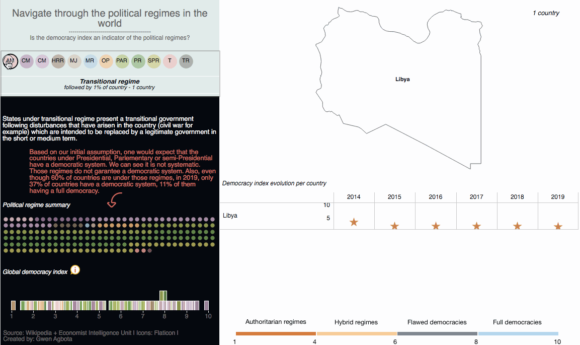
With this viz, I wanted to know more about the different political regimes today and how they affect our freedom as citizens. I ended up being surprised by two things:
- It seems like there are not as many countries as I thought that move towards democracy (37% of countries)
- It seems like democracy is not correlated with the political regimes or the political regimes might have some serious default
To play with the viz, click here.
The data
I created a dataset with the political regimes and a quick definition available in wikipedia. I completed the dataset with the democracy index calculated for each country by the Economist Unit Intelligence. The calculation is based on 60 criteria grouped into five categories: the electoral process and pluralism, civil liberties, the functioning of government, political participation and political culture. Each category has a rating on a scale from 0 to 10, and the overall index of democracy is the average of the five category indexes. From this rating, countries are classified according to four types of political regimes: democratic, imperfect democratic, hybrid or authoritarian. If you want to know more about the methodology they applied (I encourage you to do so), you can go here.
Tools
Tableau