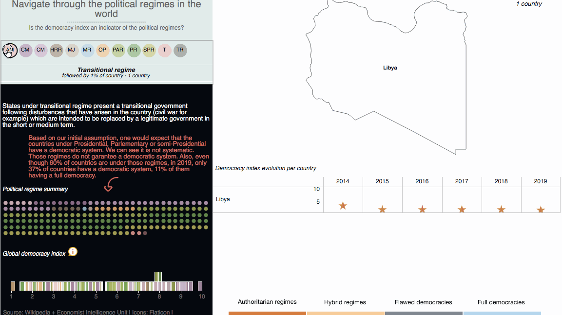
If you are into drawings, illustrations, graphics, etc... you probably know — or maybe you don't — that this month is Inktober. The challenge is to create and share an ink graphic design every day during October. This challenge has been created by Jake Parker in 2009. The goal was to improve his inking skills and develop positive drawing habits.
Last year, I bought a pretty little notebook to do one viz a day but I didn't manage to do the full year. So this challenge inspired me to get back to doing a visualization each day. Let's do that for the fortnight. Let's this month be the Viztober!!
I decided to go with one simple dataset for the fortnight and to come up with a different visualization each day. The idea here is to discuss the chart choice and its effectiveness.
This month's dataset will be based on Sustainable Development Goal 2: Zero Hunger by 2030. This is the UN definition: End hunger, achieve food security and improved nutrition, and promote sustainable agriculture.
The first indicator followed for SDG2, Target 2.1 is the prevalence of undernourishment in the world. Undernourishment is one component of malnutrition and is defined as insufficient caloric intake in the diet.
To learn more about how it is measured across the world, click here.
Let's focus on this indicator for now.
DAY 1: the bar chart race
Even though it can be difficult to use properly, I do like animated chart because it makes it easy to quickly grasp an overall trend. Also, it's attention-grabbing. It can be quite fascinating to see drastic changes happening over time.
Yet, the cons of using this type of chart are that too many things are happening at the same time, you cannot focus on all the data points and it can be quite confusing. I am not sure it's the best chart to retain specific information simply because it does not allow for specific comparisons. Another point is accessibility, can screen-readers read this chart? I tested one, it wasn't great...
Lastly, this chart is good to answer larger questions like Who is leading? Is - region name - moving forward or backward? It's more difficult to answer what the population share in Africa is in 2016. And compared to 2 years ago?
But the point here is to show that undernourishment is progressing in most parts of the world, we are not doing great to meet SGD2.1 and I think this graph shows it well.
DAY 2: the treemap
I couldn't have done worse than this chart. The treemap chart has its uses but it fails to show the point here. Treemaps are not great when we need to do precise comparisons or visualize minor differences.
I didn't display the numbers on purpose. Can you tell if undernourishment is increasing or decreasing over the years? I cannot.
I believe it's Andy Kriebel who once said “If it takes more than two seconds to tell what the fifth highest item is, it took too long”.
DAY 3: the scatter plot
I think this one is definitively interesting. It's clear, simple and pretty. One thing can be confusing, when we look at Europe for example, we're only seeing 2016 and 2019 data points because it's the same values across years so might be worth adding a notation.
To improve the readability, I would put the 50% gridline in bold and add a directional arrow on the last dot.
DAY 4: the sunburst
It's the same as with the treemap. You can easily tell undernourishment is more prevalent in Africa and least in Europe. But you cannot tell if it's increasing over time. What's great is that you can click on a node to zoom in on the elements of each year.
DAY 5: the bar chart
Better than the sunburst, it's more straightforward but personally, I am not a fan. It's not that effective and you still have a hard time reading the last blocks.
DAY 6: the radial
Not the best chart for the data we are presenting but personally, I really like this chart. The labeling is not done properly, flourish seems limited in that way or maybe I don't know how to use it yet (I am new to it). But what's great is that you can click on a node to zoom in on the elements of this node.
DAY 7: the grid of bar chart
A simple and effective chart. Allows comparison over time and across the region at the same time. The only thing maybe is that I find this to be a bit cold, it doesn't inspire an emotional connection.
DAY 8: another grid of bar chart
DAY 9: the stream graph
The stream graph is interesting but maybe not the best choice here. The fact that the size of the stream graph is increasing with time is misleading since Europe and Northern America have a decreasing prevalence.
DAY 10: the slope chart
I find the slope chart to be great for ranking and comparisons. Particularly when the variation between data points is dramatic.
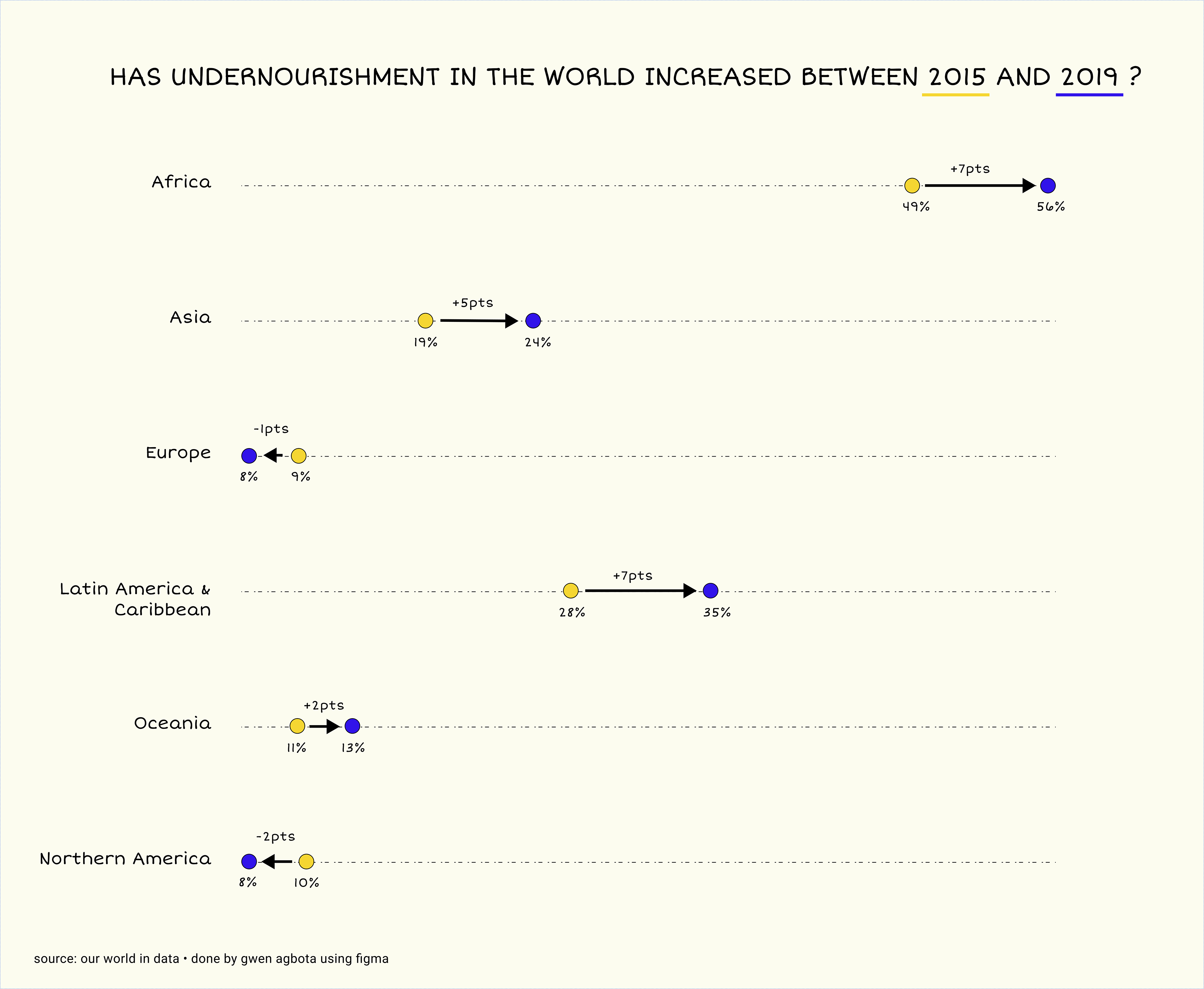
DAY 11: the arrow chart
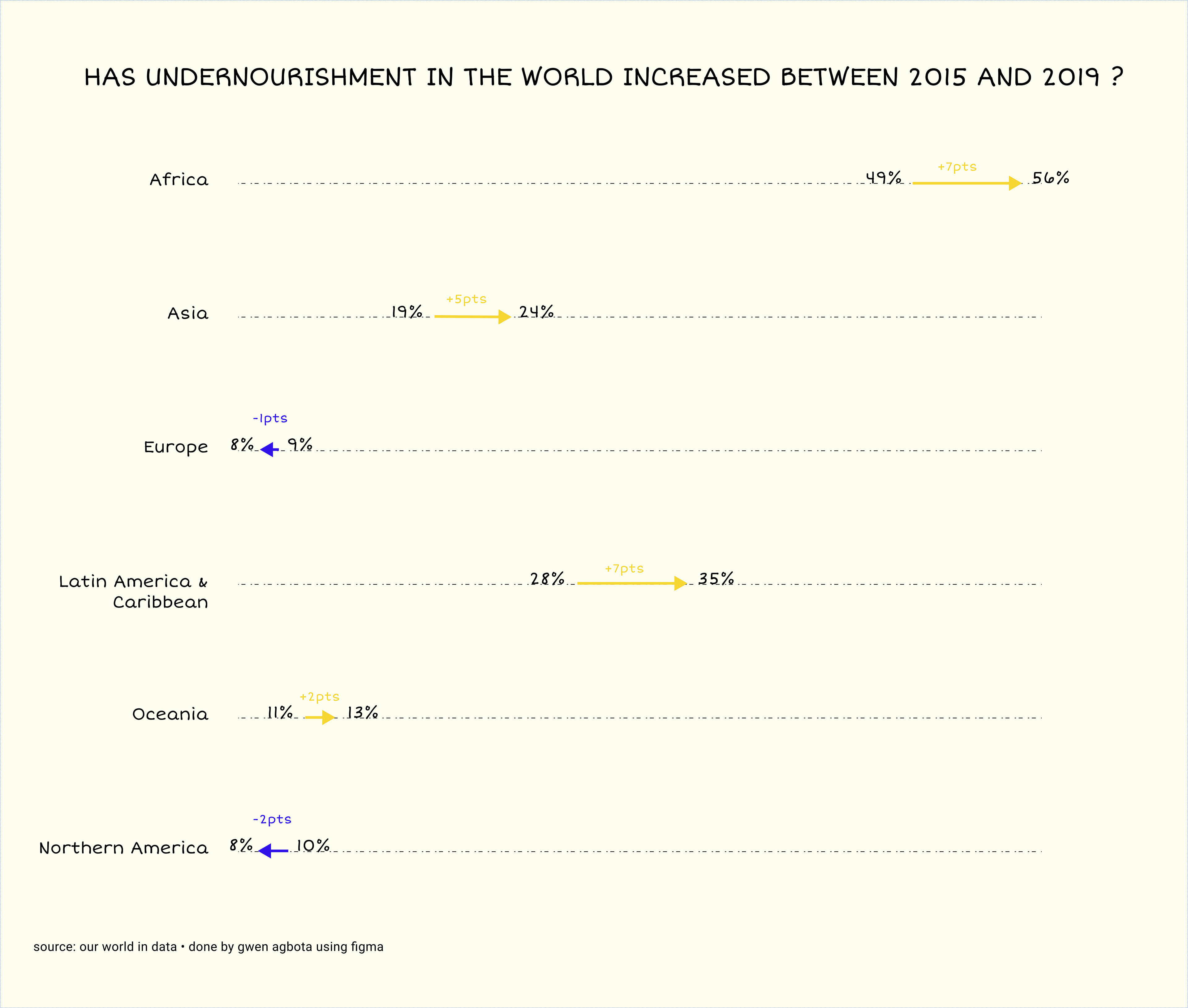
With this one, I decided to focus on the evolution between the first year and last year and drop the noise to make this chart effective in conveying the message, clear, and pretty enough to engage the reader. Buuuuut are we not missing something here? Let's take the case of Oceania. Oceania has an increase in prevalence between 2015 and 2019 but between 2018 and 2019 the prevalence is actually decreasing.
The message here is to show that we are not doing great because the prevalence is still very high but there is some kind of hope because in some regions it's decreasing. Hence if the prevalence is decreasing somewhere we don't want to hide it. So maybe I could do 2015-2018-2019.
DAY 12: the dot chart
I feel like you cannot really be wrong with this type of chart when you want to visualize simple quantitative data. It's pretty clear and easy to read.
DAY 13: the heat map

I like this one as well. It's a bit more complex to read than the previous one but still effective in conveying the message.
DAY 14: the bubble map

This is a nice one because there isn't too much information. It's clear enough to understand what the prevalence is in each region in 2019.
DAY 15: the bubbles cloud
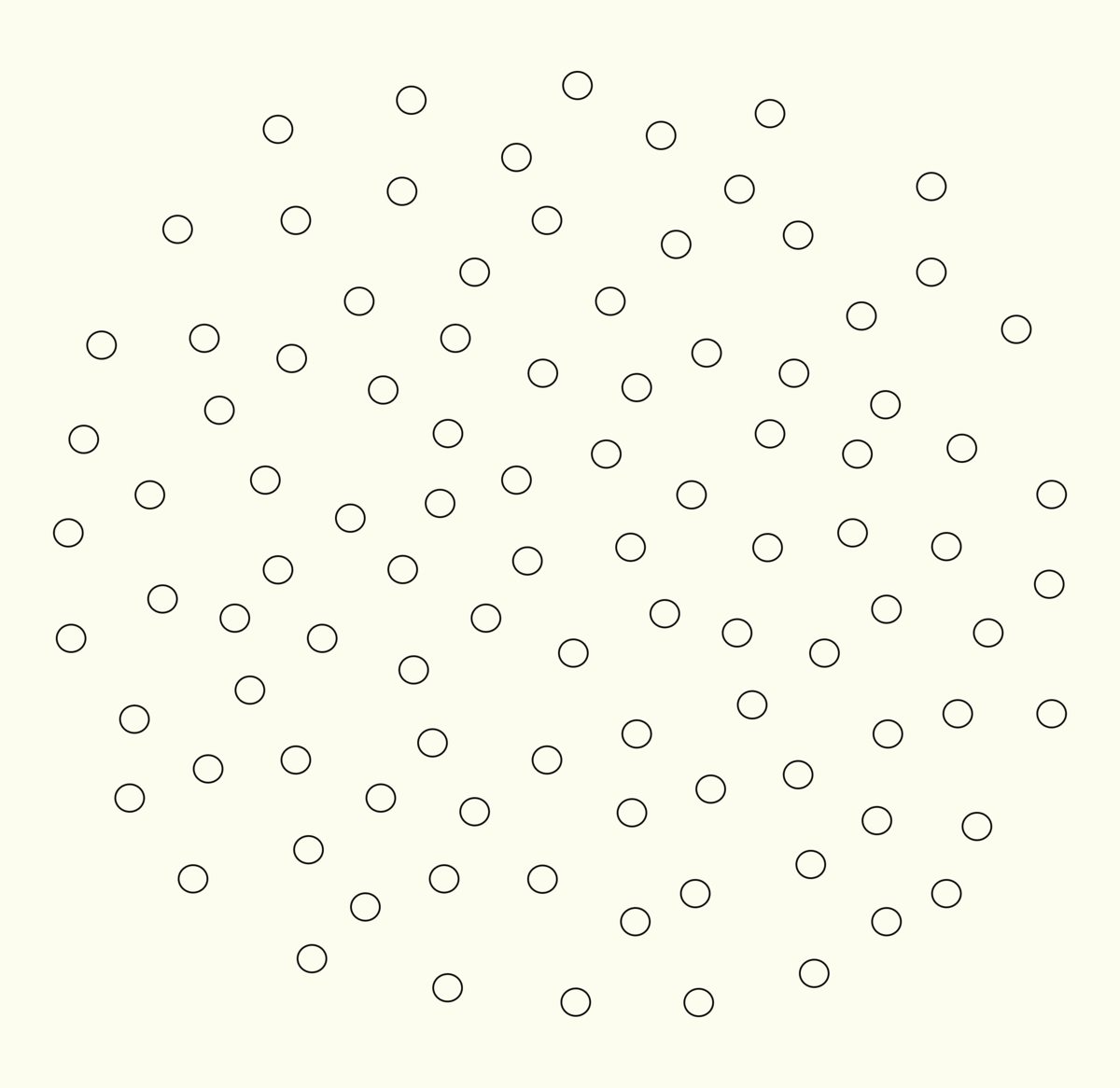
On this graph, a dot represents one person, and all dots represent 100 people. I find this type of graph to be super handy when you want to visualize percentages and make it more hard-hitting. We can better assimilate what the number we are talking about represents. Since I don't know how to do D3.js and you can't learn it overnight, I decided to make a gif instead :).
If you want to learn more about this subject, please click here.
What's interesting is that each of this visualization allows me to see something different about the data. A piece of information I didn't see or assimilate. After doing this exercise I understood that the key to choosing the right visualization is being aware of the message you want to convey to the audience.