The other day I was watching an ARTE documentary about immigrants in the Cayman Island and here I was, wanting to make a viz on migration flow in the world. There are a lot of misconceptions regarding immigration and emigration and I wanted to learn a bit more about this subject while also clarifying things a little bit.
To play with the viz, click here.
The data
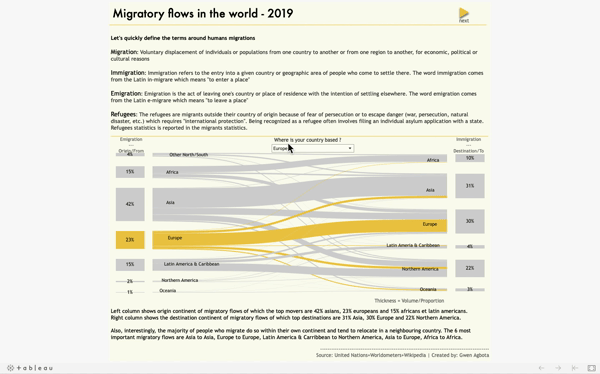
I collected the data from the united nations website - Department of economic and social affairs - The data comes in Excel files with multiple tabs and it reports migrants stock by origin and by destination and it also classifies the refugees by origin. I wanted to show 2020 migratory flows but the last date available that I could find was 2019. I completed the data with geo-loc data and 2019 worldwide population size per country.
The coverage of refugees statistics is uneven across countries. It is worth reading the methodology applied by the UN in order to understand how the census of migrants and refugees is done. To do so, click here.
For that viz, I didn't drift too much from my initial sketches as it can sometimes be and so I knew what visualization I wanted from the start. For the Sankey diagram, I used a very simple tutorial that gives you a model. Thanks vizdiff for the simplest tutorial / template for the sankey diagam. I just wish there was an explanation for each formula. For the origin/destination map, I followed this tutorial. Thanks to Infolab! By the way, they have great and really easy to follow Tableau tutorial.
Tools
Tableau